Realtime Transit Data Primer
An overview of how realtime data gets from a transit vehicle to you (the rider) and how to think about the data quality issues you experience.
![["A diagram showing a bus icon labeled 'vehicle', a rightward arrow, and then a person icon labeled 'rider'"]](/assets/img/posts/rt_diagram_1.png)
Realtime Transit Data Primer
Accuracy problems in transit trackers are a perennial favorite complaint for transit riders. Despite widespread lived experience with these issues, I’ve found that many people are not very familiar with how exactly data gets from the transit vehicle into their tracker app of choice and that this leads people to misdiagnose the data issues that they experience.
Now, in an ideal world, riders would not need to understand this. You should not need to have arcane knowledge to read the tea leaves in your transit app to know if the bus is coming. But, in the world that we have right now, issues are frequent and I hope that by explaining how these data flows work we can have a more informed conversation about the sources of problems and ultimately improve the rider experience.
Before diving in, I should note that I do not speak for any agency (or my employer) in this explanation. I work on transit data at my day job but producing realtime data is not my primary focus and this is just meant to be a conceptual overview. I reference CTA examples because it’s the main agency I use.
This explanation is also somewhat biased towards buses since they’re more common and I’m more familiar with them; there are some different nuances in how trains transmit their data but the broad strokes should be applicable.
How the data gets to you
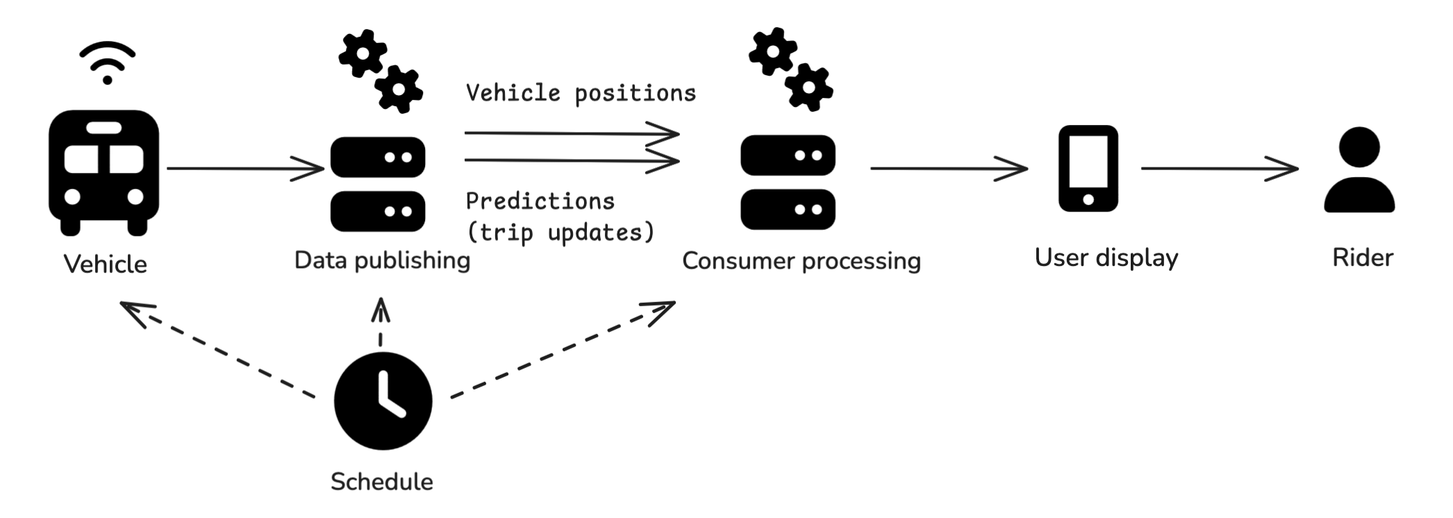 Real-time data flow schematic
When you see information about an upcoming transit vehicle arrival in an app, the data has probably gone through a version of the following process to reach you:
- The agency defined a schedule, which was likely loaded onto vehicle on-board systems and published publicly
- The vehicle transmits information about its current location
- The information from the vehicle is processed by the agency (or, often, one of their vendors), usually to produce and publish two distinct data feeds:
- A vehicle positions feed with the location of the vehicle
- A predictions or trip updates feed listing predicted arrivals at future stops on the trip
- A downstream consumer (this includes third-party apps like Google Maps, Apple Maps, Transit App, or Citymapper) is ingesting the data feeds and possibly doing its own additional data processing
- A user-facing application managed by the agency or by a third party displays the data
- You interpret the information you see in the user-facing application
Every single step in this process introduces different risks and data quality issues. I’m going to walk through some of the notable ones, but there is a wide range of possibilities.
The schedule
The scheduled service plays a couple of different roles in the realtime data process, which I’ll mostly call out in the subsequent sections, but in general: if the schedule has its own data quality issues those may propagate. The schedule for these purposes is often the public GTFS schedule data published by the agency but for internal use within the agency or with its vendors there may be richer schedule data with additional information.
The vehicle
Vehicles* have on-board systems that are transmitting their location and other information back to the systems that publish the data. This introduces a couple of failure modes:
- The vehicle needs to be matched to the correct trip: There can be issues if the schedule was not loaded correctly or if the operator does not log on correctly.
- The system needs to be transmitting the location accurately and frequently (“realtime”): Equipment can malfunction and there can be issues with GPS accuracy (e.g. urban canyon effects or stop geofences) or with connectivity to transmit the data (dead zones/weak signal.)
*Again, broad strokes – trains can be a bit different
Data publishing: vehicle positions and trip updates
Assuming that data is received from the vehicle, the agency or one of their vendors usually process that data to serve APIs that can be read by third-party apps or the user displays managed by the agency.
This processing often includes producing two separate data feeds:
- Vehicle positions: A feed that lists the location of the vehicle, usually tagged with what trip or route it is serving.
- Predictions or trip updates: A feed that lists upcoming stops on the vehicle’s trip with predicted arrival times (this feed might also list trip cancelations if supported).
Note that the CTA does not produce GTFS-RT at time of writing but it (along with its vendors) does produce analogous API feeds (some realtime locations, some realtime predictions) in a custom format.
Some issues that can be introduced at this point are:
- Labeling issues: For third party consumers in particular, it’s important that trips in these data feeds align with the trips in the schedule (more on that below)
- Prediction issues: For the trip updates feed the agency is producing estimates of when the vehicle will arrive at subsequent stops, and this introduces a bunch of potential failure points:
- If the trip is mis-assigned or there is a detour in effect (but not known to the prediction system), it’s possible the system produces predictions for a stop that will not in fact be served on this trip.
- The prediction system can produce bad predictions: This is an algorithm and it might just produce inaccurate estimates. The accuracy of the predictions might also vary by things like time of day – maybe it’s good in low-traffic conditions but bad at rush hour, or vice versa. It’s not necessarily a fixed effect.
- Location accuracy: If there is an issue with the location accuracy, that will likely propagate into the predictions feed because it might be producing predictions based on the wrong current location.
- Predictions before the trip has started: Some systems might start generating predictions for the next trip a vehicle will do before it finishes its current trip, or they might start generating predictions while the vehicle is still at the terminal; these can add uncertainty (I am particularly sensitive to this because I live near the origin of the bus I take most often.)
It’s also worth noting that the GTFS-RT spec includes another realtime feed type called “service alerts” which are often less-structured updates about a whole host of issues that are supposed to be displayed to riders, and there is an experimental trip modifications feed type to let agencies publish structured information about detours. I’m not going to get into detail on these here but one can extrapolate a bit from the above as to the possible issues with these too.
Consumer processing
Consuming applications, whether they’re managed by a third party like Google Maps, Apple Maps, Transit App, or Citymapper or by the agency itself like CTA Bus Tracker, make their own decisions about how to process the information. There are also a lot of possibilities here.
- Which feeds to use: Data consuming apps might use the agency’s locations feed but generate their own predictions, or modify the predictions generated by the agency.
- Incorporating additional data: For example, Transit App might have Go data from its users; this introduces a new dependency on the quality of the additional data and how that data is used. Agency-managed displays may have access to internal data feeds beyond (or instead of) the public ones.
- Matching the realtime feeds to the schedule (and the realtime feeds to each other): Consuming apps usually need at least some information from the schedule to display information (for example, the realtime data will list stops but not a trip shape on the street network), so if there are issues with the schedule data or with the labeling of the realtime data that disrupts this matching, the third party processing may not work. Consumers are also deciding how much to rely on the schedule, e.g., whether or not to show scheduled trips that don’t (yet) have any realtime data.
- Cancelations are another source of uncertainty: Consumers have to make their own decisions about how to decide a trip isn’t happening. Even if the data feed includes explicit information about cancelations, there’s still a question of how reliably those are published and whether the consumer should impute additional cancelations.
User display
The consuming applications are then experienced by riders as a variety of user-facing displays of the information they’ve processed.
For the CTA, just as an example, you can see:
- Stop or station boards (the screens on the platform or bus shelter that list upcoming arrivals)
- CTA Bus Tracker
- The SMS (texting) updates for each bus stop
- Ventra app
- Fully third party apps like Google Maps, Apple Maps, Transit App, Citymapper, etc.
Each of these sources are downstream of all the choices and data quality considerations outlined to this point.
Some of the biggest choices that users can look for at this point are whether or how the schedule, vehicle location, and prediction information is displayed. This is not standard across apps. (Here is Transit App’s writeup of the info they display.) At this point, riders should consider:
- Am I seeing scheduled information, realtime information, or both?
- If I am seeing realtime predicted arrivals, can I see the current location of the vehicle associated with the prediction? (E.g.: If I’m waiting for the #22 at Clark & Wilson and an app says there’s realtime info that there will be a northbound bus in 1 minute but I can see that the only northbound bus on the route is at Belmont, I might be skeptical)
Rider
You as the rider are also introducing variables with how you interpret the information you’re seeing and what array of different displays you consult. For example I have changed how I interpret displays over the course of the last 5 years as I have trusted scheduled data less and focused more on vehicle location.
Visibility
One meta-point to keep in mind regarding all the above items is that the only elements that are publicly and uniformly visible from this process are the GTFS schedule data and the public realtime data feeds (usually vehicle positions and trip updates). All of the processing to produce that data and all of the design choices made around that data by consumers are black boxes. Two different apps can show different things and, while you can consult the upstream data feeds to make some informed guesses about what choices the apps are making, you can’t know why for certain (at least not without additional access to the internal logic of the apps).
Concluding thoughts
In general, I think that the distinction between vehicle location and trip prediction data types is one of the most critical things to understand in this space. Knowing where a vehicle currently is is relatively straightforward. Interpreting what that current location means about when it will arrive at subsequent stops is more complicated for the reasons described above.
I hope this overview has helped explain the steps that lead to you seeing a predicted arrival time for a vehicle in a trip planning app and suggests some ways to try to diagnose why you see different things in different places. I hope that by having more precise conversations about these things we can help agencies and trip planning apps understand the issues riders experience and ultimately address them.
Additional reading
- I highly recommend the CTA Chi Hack Night presentation about what it took for them to publish trip cancelation information.
- I always like to plug the California Transit Data Guidelines as one great example of formalizing data quality expectations for agencies.
- This writeup by Ritesh Warade is focused on why and how “zombie” and ghost buses happen. It’s partly a plug for Swiftly (a vendor in this space) but I think it’s a helpful explanation and it also shows how a vendor pitches its services to agencies around these issues.
Icons in the diagram are from Font Awesome, diagram was made in Excalidraw.